4 Trendy Colour Combinations For 2016
Interior Design & Decor3 minutes read
3506 views
3506 views
We're slowly easing into 2016, and with a new year comes a new set of trendy shades. And where wall colours are concerned, there are a few combinations which have been predicted will become hits in the coming year. So if you're feeling adventurous, maybe you could try injecting some of these shades into your home.
1. Green
Credits: traviasuite.com
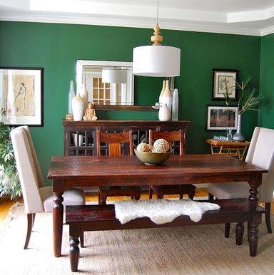
Green is slowly, but surely, gaining popularity, and most shades of the colour works for your walls. If you prefer something livelier, try mixing natural shades of green with decorations like stones, plants or even bamboo. This creates a rather earthy and eco friendly feel, which we're seeing more home owners start to do.
Or, you could try a deeper, darker green, something along the shades of emerald. It primarily provides a very luxurious vibe to your home, but if paired with lighter shades or even wood, gives a more fun and modern feeling to the atmosphere.
2. Lavender and Purple
Credits: minaturesbylucinda.blogspot.com
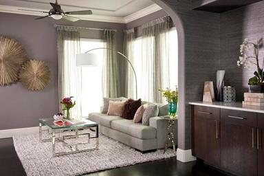
These are pretty popular tones and they're going to stay in trend, but there's no need to worry about their tendency to look too feminine. They're actually great to play mix and match with, especially with shades such as grey, blue or event black.
Sometimes people tend to think such colours are merely great for children's rooms, but they actually have the ability to bring a sense of elegance and sophistication to a space. For a more upscale feel, add some gold decorations to your lavender walls.
3. Orange and Bronze
Credits: boweryhouse.org
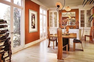
We love brightening up a room with warmer tones, and the colour combination of orange and bronze shades with elements like beige furniture or brick walls will definitely complement one another.
This set of hues feel more exciting, since they're comparatively brighter, so if you're leaning towards a livelier looking home, try experimenting with these shades. They're definitely far from the typical colours people would use, but where's the fun in sprucing up your interior without getting out of the usual comfort zone right?
4. Rose Quartz and Serenity
Credits: thekitchn.com
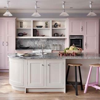
The Pantone colour of 2016 has recently been announced, and for the first time they're mixing two shades: Rose Quartz and Serenity. Paired together they create a rather soothing effect, and the feminine shades are said to have been picked since we're transcending into an era where gender blur is becoming more apparent.
The colour combination works for plenty of elements around the house, but we're seeing that people have been swaying towards having their kitchens constructed in these hues. We're not sure why, but it's probably because they've been overused too many times on bedroom walls, whilst kitchens aren't usually done up in such light shades.
Request for quotes and we'll match you with a selection of Interior Designers!
Previous
4 Ways To Cosy Up Big Houses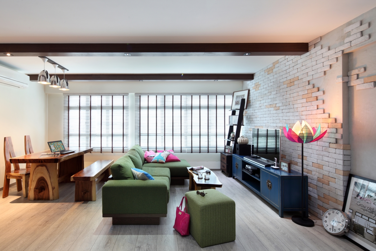


 Sign Up with Google
.jpg)