[Hong Kong Renovation Case] 450-sq.ft Apartment with Japanese Industrial Style
Interior Design & Decor5 minutes read
2920 views
2920 views
Table of Contents
Mix and match style is very popular for interior design, however, it’s not easy to match styles well. Deco-Man is taking you to an apartment with Japanese industrial style. Let’s see what effect will the mix and match bring.
Basic information
Kennedy Town Building / Saleable area 450 sq. ft. / 1.5 bedrooms and 2 living rooms / Cost is about HK$550,000 million / Number of occupants 2 adults
The owner hopes to integrate industrial and Japanese style into the home. The flexible and functional interior design is a very challenging project for the designer Andrew. In addition to starting with colours and building materials, he also incorporates Japanese culture to let the design reconcile better.
Compartment changes: Positions of kitchen and toilet are swapped, utilising the space more wisely

The original apartment looks like the graph above with 2 bedrooms and 1 living room. The bathroom and kitchen are both small and interdependent. Because the owner wanted a place for bathing, Andrew boldly changed the compartment, remodeling the bathroom and one of the rooms into a kitchen, while the bathroom was moved to the original kitchen. This change can make the kitchen and bathroom space bigger and more practical.

As a result of demolishing a room, the living room has a lot of space. In order to enhance the taste of the Japanese style, Andrew added a semi-open Japanese room in front of the bedroom. This design adds half a room to the apartment. A dark and light wood shoe cabinet was added to the entrance to easily separate the dining room and the living room, makes the apartment containing 1.5 bedrooms and 2 living rooms. The use of space is excellent.
Visual levels: Japanese space culture cleverly divides regions by hierarchy

Observing the interior, you will find that there are many visual levels, such as the hanging bookshelves in the Japanese room, and the wooden frame with long glass in the kitchen, etc. The overall feeling creates a lot of protrusions and inlays, and different spaces are stacked, creating different visual effects.
Andrew pointed out that this is inspired by the Japanese culture of respecting personal space. Even at home, he hopes to divide different personal spaces with a certain degree of privacy. Therefore, in different areas such as Japanese rooms and window sills, wooden frames are used, which is beautiful and at the same time, serves as a not-so-tough method to emphasize the boundaries of the areas.
Living room design: Cement texture creates industrial style, Japanese wood elements achieve balance and comfort

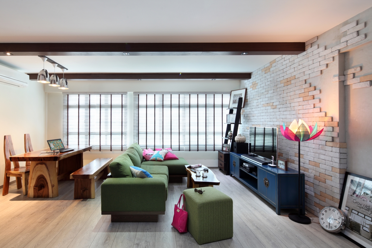
Industrial style often uses cement texture walls. This time the wall in living room uses cement texture walls, and wood frames are used to create wooden frames, imitating the wooden house structure of Japanese old houses, mixing the two styles.
In addition, the floor uses dark gray stone texture tiles, which collide with the lively wooden elements of the whole house. Visually, the two styles occupies half of the unit evenly, with white on the top and gray on the bottom, giving a balanced and comfortable look.
A T-shaped wooden beam is installed directly above the living room, which feels like a wooden beam in a Japanese house. Actually, this T-shaped beam is part of the original structure. Andrew cleverly wrapped the beam with wood, turning the shortcomings of the unit into a part of the design, letting the beam blend into the space.

In the dining room, there is a dining table with black iron brackets and dark wood countertops. The neatly lined dining table brings out an industrial flavour. A wooden frame is added to the window sill next to the dining table, the simple white wall is matched with a wooden frame. The exquisite bamboo and rattan round hanging light is once again blended with the original industrial style and the soft Japanese design.
Japanese room design: Exquisite multi-purpose room for work, gatherings and storage

The most eye-catching place in the whole house must be the Japanese-style tatami space in front of the entrance, bring out a sense of tranquility. The semi-open Japanese room is surrounded by light wood and small stairs to separate the space. The light-colored Japanese room is balanced by a deep wood-colored workbench deep inside the Japanese room.
The usage of this Japanese room can change accordingly. After getting up in the morning, it is a cloakroom. The wooden table can be used when the houseowner is working. When friends visit, they can sit on the cool linen mat to chat and gather. The design of the Japanese room also considers storage space, and many items can be stored under the raised platform.
Bedroom design: Minimalist design, a small tea room with sea view hidden inside

Inside the glass sliding door of the Japanese room is the bedroom. The minimalist design of the bedroom hides one of Andrew’s favorite locations, which is the window sill. The window sill is a position that people love and hate because it is difficult to modify to give practical use.
But Andrew view it as the closest place to the sea in the apartment with excellent views. The wooden frame, wooden window grilles and a small coffee table transformed it into a small tea room. When the gentle sunlight enters the room, the houseowner can enjoy the view, a cup of tea and a book for a quiet moment.
Kitchen design: Glass semi-open kitchen

A door is hidden in the cement back wall of the living room, and after entering, it is a small space different from other areas. The bedroom is dominated by Japanese style, while the kitchen and bathroom tend to have an industrial style with a rigid texture. The kitchen is dominated by gray colour, and different levels of gray scale enhance the industrial flavor of the kitchen. Besides, wooden kitchen cabinets and wooden shutters are added to the top to reduce the coldness of the industrial style.
The most special thing about the kitchen is that there is a large long glass surrounded by a wooden frame, which changes the kitchen to a semi-open style and allows the houseowner to observe the living room while cooking without causing oily fumes to float outside.
Bathroom design: Stylish hotel design with Japanese style bathtub

The bathroom also uses extremely dark stone wall tiles and floor tiles in a large area to bring out the industrial style. As it has a limited space, the oak storage cabinets that are lighter than the living room are used to create a more balancing look. The wooden toilet paper hanger extended from the cabinet is also very thoughtful, and the little utensils are enough to add onto the Japanese style.

The bathroom was relocated to the original location of the kitchen as mentioned as the owner wanted a bathing area. After Andrew made this move, the bathroom is large enough to accommodate toilet, shower area and a bathtub. The bathroom design has a modern industrial feel. Except for the gray stone wall, black faucet and rain shower are used, and the built-in wall is used as a place for showering supplies storage, just like a fashionable hotel.
The bathing position is not a traditional bathtub, but a tall Japanese-style bath made of bricks. Andrew set up the stairs intentionally, so that the owners can enjoy a stylish and comfortable bathing time.
This article was originally published on HKDecoman.
HKDecoman, now going global as Deco-Man, is a Hong Kong-based renovation platform which provides professional consultancy services and pioneers in the development of A.I. homeowner-engineer matching. We aim at educating the public about the art of home renovation, and have our eyes on transforming the traditional renovation industry, bringing standardisation, transparency, convenience and automation to the business.
Request for quotes and we'll match you with a selection of Interior Designers!
Previous
[Know More about Renovation] 2 must-know points to consider for small kitchen renovationNext
[Cleaning tips] 5 ways to clean thermos bottle


 Sign Up with Google

.jpg)


