5 Reasons To Love This SkyTerrace @ Dawson Unit
Interior Design & Decor4 minutes read
4916 views
4916 views
This scandinavian themed home in Dawson has caught out eye, for both its minimalistic touch and chic finishing. Here are the top five parts about the place we love most.
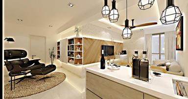
1) Pendant Lights
Credit: D'zire Interior
We have a soft spot for pendant lights. Even if they're not the most unique of designs, we can't help but fall harder for a home if they have pendant lights installed. They instantly make a home look more modern and attractive, directing your eye towards them.
We love that the owner purchased more than one light of the same design, and displayed them at varying lengths. It makes the impact even bigger, and now they're a standout element in the living room.
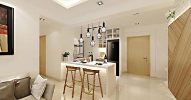
2) All That White Against Wood
Credit: D'zire Interior
It's the trend these days, to douse your house in as much white as possible. And that's why we love this space, because the endless white walls and ceiling make it look really spacious. Some of their furniture, the kitchen island for example, is kept white too, which enhances the effect even more.
They've cleverly decided on wooden doors and have also put some wooden furniture around the space, resulting in a swedish sort of finish which is both elegant and simple. Their home looks bright and lively, definitely a space we'd crave to live in.
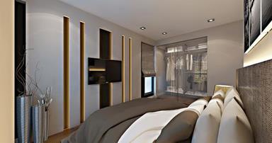
3) Transparent Closet
Credit: D'zire Interior
The bedroom looks gorgeous, but the one element we find our eyes zooming towards is the transparent wardrobe. It has a really classy effect on the room, and the fact that it's a unique touch makes the room look even more desirable.
This concept mostly works because their clothes match the colour theme of their home, since they've displayed mostly white and cream coloured clothing in their wardrobe. But it works even if you own a series of colourful clothes, you just have to diligently sort them by colour all the time.
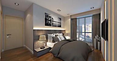
4) Decorative Panel
Credit: D'zire Interior
We're also attracted to the decorative panel behind the bed. The bed is without a headrest, but we think the decorative panel gives it a more unique touch. The colour scheme blends in with their minmalistic muted tones, and the fact that it's textured adds character to it.
We love that they purchased lamps which pretty much matched the panel as well, bringing out its effect even more, and also ensures there aren't too many different elements going on since there is quite a bit of consistency.
5) Industrial Touch
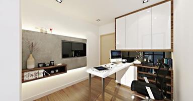
Credit: D'zire Interior
Unlike their living room, the study isn't just filled with just white and wood. They've added a little bit of industrial touch as well. They've created a grey wall panel, immediately shifting your focus onto that area, since the colour pops compared to the rather light tone of the room.
We love it because there's contrast in the space, so the place doesn't look too ordinary and dull. We also love that there's a decorative shelf and various ornaments placed against the panel, making the area pop even more.
Request for quotes and we'll match you with a selection of Interior Designers!
Previous
5 Clever Ways To Blend The Old With The New


 Sign Up with Google

.jpg)