A Stunning Swedish Interior Design That Will Inspire You
Interior Design & Decor4 minutes read
4871 views
4871 views
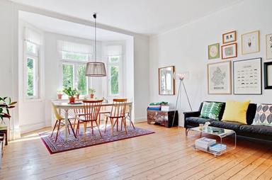
Many of us lust after the simple styles of Swedish homes, even going as far as transforming our own interiors to mirror theirs. So here's a little treat from an incredibly gorgeous house located in Sweden itself, kept simple yet so inviting at the same time.
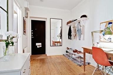
The walk in from the main door already looks like you're entering a beautiful haven, with coats and shoes neatly stacked at the side, area furnished with a tiny bit of carpeting and white shelving. The wooden flooring which fill the place is gorgeous, and the tiny pops of colour from the black door and orange chair keeps the space from being entirely whitewashed.
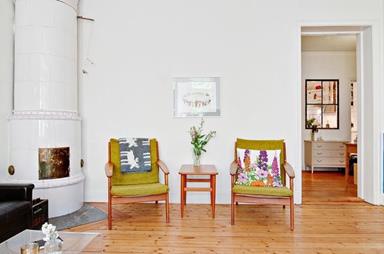
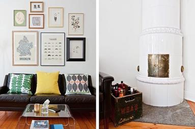
The living area is a whole mix of colour, the sofa and chairs are barely the same shade, and the pillow designs are entirely different from one another, each individually striking yet looking cohesive as a whole. The walls are littered with frames, a cute addition to the space, while a sleek glass table sits in the middle of it all.
It's such a quaint little area that feels entirely warm and welcoming, totally fit for family bonding or even for guests to lounge around for hours.
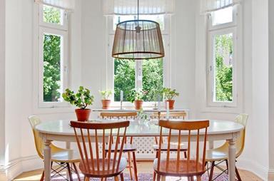
The dining area is another stunner, with its windows letting in a massive amount of light, making the space look that much more beautiful and airy. We're particularly in love with the fact they mixed two different chair designs at the same table, which shakes things up a bit and makes the overall setting look more interesting as well.
Adding plants also makes the place look more homely, especially when the area just outside is filled with lush greenery. It's a space we'd definitely love to dine at for sure.
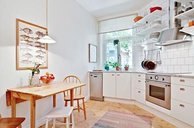
Judging by its angular shape, the kitchen is probably situated at the corner of their house, which makes it look more odd and cozy in all honesty. The blend of white with a few pieces of wooden furniture works great too.
Even at first glance this space already looks like it could be anyone's dream kitchen. It wouldn't be counted a chore having to whip up a meal if it's done in such a lovely setting.
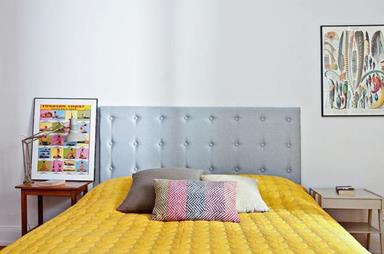
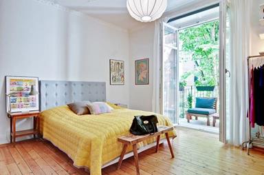
There's a bit more colour in the bedroom, much like their living room, which would make sense, because bedrooms are way too personal to be kept simple and white. We love the blend of colour coming from the bedpost, bedsheets and pillows.
There's a peek of a clothing rack at the side, which we're definitely a fan of, because the clothes being out in the open is bound to add more colour and character to the bedroom.
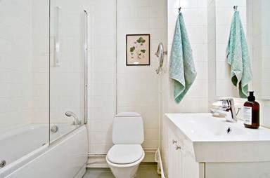
Even with the bathroom we have nothing but positive remarks. We love its clean look, everything kept white with nothing too intricate or detailed. It makes the tight space look that much bigger, and the area looks way brighter too.
Photo Credits: http://www.bjurfors.se/
Request for quotes and we'll match you with a selection of Interior Designers!
Previous
5 Awesome DIY Ideas For Your Home


 Sign Up with Google

.jpg)