An Alluring Mixture Of Themes For This Yishun BTO Flat
Interior Design & Decor4 minutes read
4016 views
4016 views
After staring long and hard at this 5 room BTO HDB flat in Yishun, we still can't quite pinpoint our favourite aspect of the place, especially since every room is filled to the brim with an array of remarkable details.
And we also love how the home owners have balanced two separate themes, industrial and retro, while successfully merging both of them flawlessly. So if you're looking for some serious interior inspiration, we'd bet you'll find it right here!

First off, we have the living room. And at first sight we were pretty much already blown away. Where do we even start? From the amazing sofa and coffee table? Or the vibrant pillow cases and framed images?
And then there's the obvious standout piece sitting right in the middle, a bright red barber chair which certainly makes for a very interesting choice. Yet it fits right into the setting, and we're sure all guests who drop by never fail to give it a try.
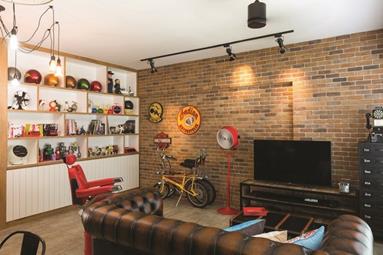
But wait, there's more. Here's another view of the living room, where you can see a whole bunch of wondrous things going on. The area features a beautiful textured brick wall, right next to an extensive shelf of vintage collectables.
There's certainly no lack of colour where their display items are concerned, and in our opinion the vintage picks were curated extremely well. Our eyes are also glued to the standing fan, a unique piece that's definitely eye-catching.
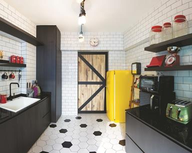
Even the kitchen is far from lackluster, colours littering the place in every single corner. Retro pieces can also be spotted everywhere, and our favourite pick would probably be the adorable toaster sitting on the counter.
The space is also wonderfully colour coordinated, with the use of primary and secondary colours providing a magnificent pop against their monochromatic tiled backdrop. It must be an ultimate joy preparing meals in such a gorgeous setting, and we must admit this is as close as it gets to our dream kitchen.
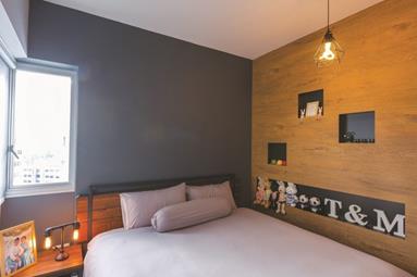
The colour palette becomes a little more toned down in the bedroom, the space filled with a muted shade of grey and some wooden elements to match. The bedsheets are kept white, adding even more simplicity to the little haven.
From the looks of it, it's a lovely and cozy area, so we'd say it's definitely a smart move on the home owners' part to have emitted a bunch of colours from the space.
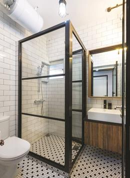
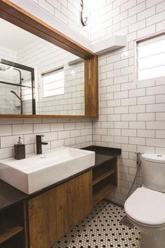
The beauty of this home even extends to their bathroom, which comes across as a luxe and vintage looking area. The walls and floor are once again tiled, much like the kitchen, with the transparent shower area upping its posh levels.
At the side we have a little bit of wood added into the mix, tastefully done, the material hardly overwhelming the exquisite bathroom setting while still making its presence felt.
Project by H2O Interior Renovation.
Request for quotes and we'll match you with a selection of Interior Designers!
Previous
How To Bring Tranquility Into The Bedroom


 Sign Up with Google

.jpg)