Highlights of the Colours Symposium at SIDS Fest 2019
Interior Design & Decor5 minutes read
5017 views
5017 views
The Society of Interior Designers Singapore (SIDS) had their annual event - the SIDS Festival - as part of the Architecture & Building Series Expo at Marina Bay Sands Singapore, which ran from 1 to 3 October 2019.
The society’s chosen theme for this year was ‘Colours’, and what better way to celebrate the power of colours and their many roles in design than to have a Colours Symposium?
This Colours Symposium, which was on 1 October, was a one-day, three-hour event where designers, students, and vendors alike attended a series of talks centered around colours.
Missed these talks? Love colours and want to know what happened at the Symposium?
We bring to you the talks, the highlights of the Colours Symposium, so recount with us as we took a look back at what was said.
SIDFest Introduction and Welcome Speech
Mr Jackie Lai
Honorary Secretary of SIDS and Chair for SIDFest 2019
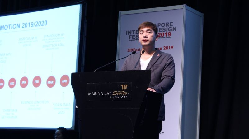
Image © RenoTalk media team
With his short welcome speech, Mr Lai introduced the theme for this year’s SIDS Festival - Colours. He reiterated the power of colours to ‘create emotions’ and ‘shift behaviours’, and cited their importance and relevance in keeping up with interior trends, creating brands, and marketing.
This is why certain famous logos are of specific colours - reds and yellows are vibrant and welcoming, blue is the colour of peace and security, while green on a logo means you can trust the brand with your health. A carefully picked colour can determine the rise or fall of any brand.
Trending colours were then mentioned - the new neutrals (neutral hues of beiges such as coffee, caramel, cinnamon, and chestnut) as the 2019 trend for interior colours, as well as millenial-friendly milky ice-cream colours like pastel tints of pinks, blues, greens, and whites.
Welcome Speech
Professor Keat Ong
President of SIDS
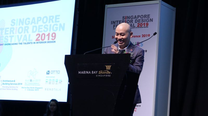
Image © RenoTalk media team
Professor Ong expressed his optimism for the local interior design industry, reminding attendees that the annual SIDS Fest is a celebration of Singapore’s interior design profession and industry.
As current president of SIDS, he has helped the Society organise many design events over the past year and looks forward to the launch of new programmes under the Singapore Interior Design Award (SIDA) for student designers.
Via a design report completed in October 2018 through a collaboration between SIDS and Frost and Sullivan, Professor Ong recommended five vital pillars to elevate Singapore’s design industry for the future:
- Improving talent pool
- Encouraging internationalisation
- Improving productivity
- Adopting technology and innovation
- Focusing on branding and awareness
Colours And Intelligent Fabrics
Marta Kokot
Director, Business Development, Asia
AquaClean Group
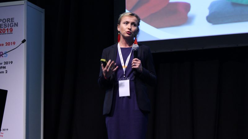
Image © RenoTalk media team
Ms Kokot is the Director of Business Development in Asia for AquaClean Group, which specialises in upholstery, product innovation, and high-quality textiles. She advised attendees to consider the following factors when selecting fabrics for upholstery projects.
Performance
- Fabric should be easy to clean and maintain
- Fabric should be durable
- Fabric should be both seepage-repellent and water-repellent
- Fabric should be easy to clean with water even after 24 hours - an ideal condition for hotel rooms
Safety
- Fabric should be equipped with Safe Front Technology,
- Fabric should be preferably certified with Okeo-Tex Standard 100
- Fabric should be Perfluorinated Compound (PFC)-free
- Fabric should be fire-retardant, as per British standard
- Fabric should be preferably from a trusted and ethical source
Aesthetics
- What are the techniques used in the fabric’s fabrication?
- Was the fabric made using the Jacquard technique, which uses manufacturing methods including texturized yarns, digital printing, and flocking?
- What is the fabric’s softness?
- Did the fabric gets its colour via fibres or dyes?
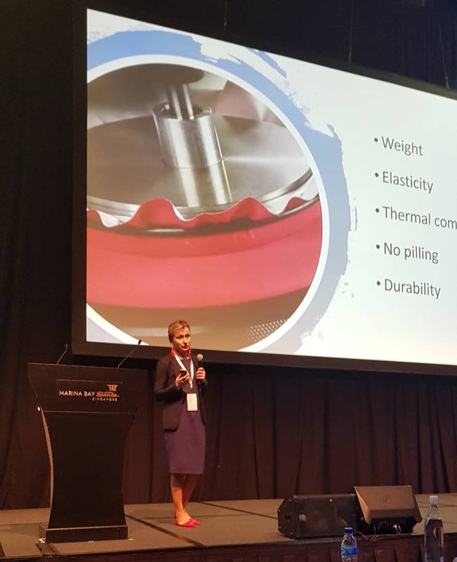
Structure
- What is the fabric’s weight?
- What is the fabric’s elasticity?
- What is the fabric’s thermal comfort?
- Fabric should preferably have no pilling
- What is the fabric’s durability? The Martindale test is an excellent gage to determine how many usage cycles a fabric can withstand before wear and tear.
Lifestyle
- Does the fabric click with today’s interior trends?
- Will the fabric fit well in a home office, in an age where the workplace should feel like home?
- Is the fabric versatile enough to fit both commercial and residential spaces?
Health
- Fabric should be free of toxic chemicals
Ms Kokot also shared images of some of AquaClean’s interior projects, including a San Francisco Coffee outlet in Malaysia, lifestyle hubs in the United States and Europe, corporate dining rooms in Singapore, Changi Airport, and the National Gallery.
From this portfolio’s presentation, it was observed that bright colours like pinks and greens were used to evoke comfort, relaxation, and peace in the lifestyle hubs and cafes, while neutrals and navy blues were used for corporate, formal settings.
Connecting Emotions
Ms Isabelle Miaja
Founder
Miaja Design Group
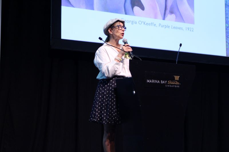
Ms Miaja was the second keynote speaker for the Colours Symposium; she spoke about the psychology of colours, and how different colours bring out different moods and emotions in art and design.
She addresses the science behind colour, pointing out that to better understand colours, designers should ‘look at science to understand the art of colour’.
Colours, she reminded attendees, have three properties: Hue, Value, and Intensity. Tints are light values of colours, while shades are their darker values. Pure hues are high-intensity colours, while complementary colours are formed through varying the intensity of different hues.
Ms Miaja also mentioned some of our favourite colours, explaining that different cultural contexts can create varying (sometimes contrasting) meanings for them. We probably could not look at some colours the same way again.
- Warm colours such as red, orange, and yellow connote ‘activeness’ and call for action
- Cool colours such as blue and green connote ‘passiveness’ and put one in a calm, relaxed mood
- Purple, in some cultures, could mean luxury, opulence, power, and royalty. When paired with complementary colours, it could also mean magic and creativity. However, some purplish hues could also mean an evil, calculative personality.
- Green is one of the prime colours of the world, as Ms Miaja pointed out. It can stand for peace, health, harmony, and balance. This is why some lifestyle and medical brands use this colour in their logos and marketing collaterals. However, as seen in some media forms, light greens (especially when paired with purple) point to an evil or malicious persona. Greens are also known to represent greed and jealousy.
- Blue has diverse meanings depending on the location — this colour connotes peace, protection, safety, protection, and healing. It is thus often chosen for public spaces to make all who enter them feel secure — banks, police stations, waiting areas, and hospitals. But interestingly, blue also has a negative meaning — sadness and deep sorrow. Hence the term ‘feeling blue’.
- Yellow is another colour with double meanings, having been used in many different cultures to represent different things. In America, yellow means sunshine, hope, joy and optimism. But in France, yellow means jealousy and betrayal. Also, in 10th-century France, yellow was painted on the doors of criminals in the 10th century. Not only that, yellow means sickness and old age, and the term ‘yellow dog’ was used to describe something useless or beyond saving. Some public organisations use yellow to represent warning and wariness.
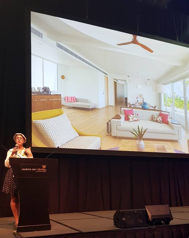
Image © RenoTalk media team
Other colours and their meanings explored included:
- Red: Ambition, passion, romance, power, fire, revitalisation, danger, threats, attractive, draw attention
- Brown: Earth, being grounded, harmony, dirty, muddy
- Black: Power, authority, element of water (in Chinese culture), protection, death, evil, rebirth, maturity, elegance
- White: Purity, innocence, good, cleanliness, clinical feeling, death (in Chinese culture), mourning, sterility, lifelessness
Before concluding her speech, Ms Miaja advised attendees to consider the effects certain colours would have on the spaces they are designing, and to be careful about hastily picking colours just because they look nice.
She then reminded that designers have to be responsible in creating impactful spaces for their clients through the balanced, disciplined use of colours.
Introduction of Coohom Design and Visualisation Platform
Mr. Jonathan Jaya Sudhir
Managing Director at Smart Décor

The last speech was a presentation weaved in with a demonstration. Mr Sudhir introduced Coohom’s design and visualisation software, designed to make 3D drafting and high-speed rendering easier and quicker.
Coohom is a cloud-based three-in-one 3D visualisation platform for both designers and homeowners. It offers 3D drawing and planning, which can produce a high-speed rendering under one minute. After the draft is done, it can be viewed via augmented and virtual realities.
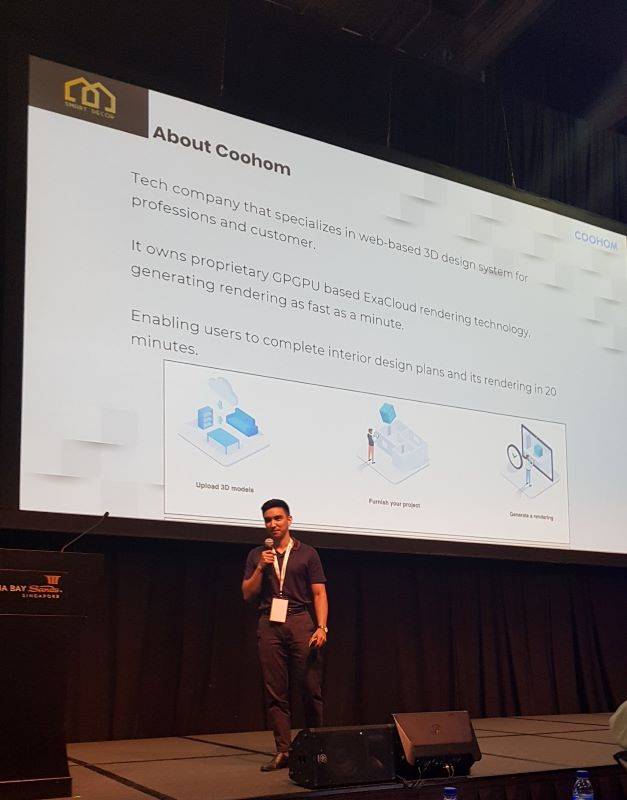
Image © RenoTalk media team
The implementation of Coohom will help design managers:
- Track, manage, and store project designs via unlimited cloud-based storage on AWS
- Upload 3D Max and Sketchup files directly onto Coohom’s platform and instantly visualise the models
- Set and manage accounts easily with its project management tool
- Pick from 200,000 3D models from Coohom’s enterprise and public library
- Source for interior design talent easily through creation of opportunities and collaborations with local institutions to bring fresh talent into the industry
Coohom will also help designers to:
- Convert a JPG or CAD of a floorplan under 10 seconds
- Visualise their drafted designs with VR and AR capabilities via drag-and-drop camera, 4K UHF and 720 panorama settings
- Choose out of eight preset settings to reduce high-quality rendering time even more
- Render their drafts as much as they like, under 100 seconds each time
- Work on-site, thus reducing lead time, costs, and the need to outsource
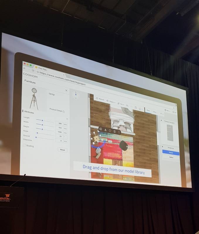
Image © RenoTalk media team
Mr Sudhir then concluded his speech by sharing about a recent project where Coohom was used to communicate design ideas between a homeowner, his wife, and their interior designer. With Coohom, the meeting between the homeowner and the interior designer took only 20 minutes, and the homeowner was able to relay his needs and interests easily. A QR code was generated so that the homeowner can enter a virtual reality tour of the designed space no matter where he was.
If you want to try using Coohom’s design and visualisation platform for yourself, visit the website here.
---
With Mr Sudhir’s speech, the Colours Symposium came to a close. With a group photo as a last hurrah, attendees came away from the talks with a newfound appreciation for colours and their impact on interior design.
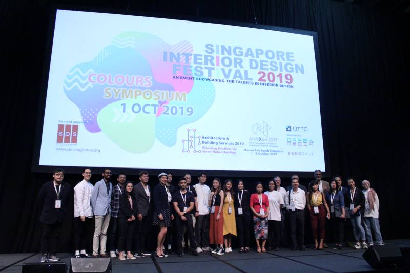
Image © RenoTalk media team
Request for quotes and we'll match you with a selection of Interior Designers!
Previous
Big Ideas for Small Living Spaces


 Sign Up with Google
.jpg)

