Home Tour: Breaking Boundaries
Interior Design & Decor2 minutes read
4391 views
4391 views
Homeowners Kenny and Michelle believe the less segregation there is within their home, the better. Led by Irene from Its Design and Built Associates, the couple’s home renovation process started with the hacking of numerous walls.
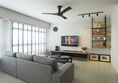
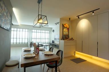
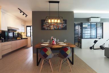
The living room, dining area and kitchen have been combined into one, with the elimination of walls not only extending the amount of space they have to play with but also allowing more wind to easily pass through
Adding extra quirk to the abode is Kenny and Michelle’s dining area, and in it sits a table surrounded by two types of seating. On one side there’s a bench connected to the corridor wall while two vibrant patchwork chairs occupy the other end.
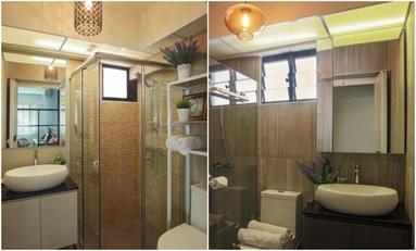
Both bathrooms in the abode were designed to look slightly different. The lavatory in the master bedroom features a hefty amount of black so it’d look more like a hotel bathroom while orange walls were chosen for the common toilet to imitate the vibes of a resort.
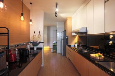
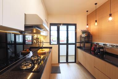
Wood is the most used material in the couple’s kitchen. Because of the lack of space, Irene suggested cutting down on storage so the area won’t look overly congested. Instead, she chose to substitute a row of cupboards with pendant lights and a wooden feature wall.
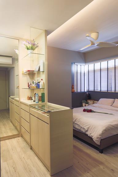
Walk-in wardrobes are pretty much the trend these days. However, Kenny and Michelle’s bedroom isn’t large enough to fit an entire walk-in closet. What Irene did instead, was tweak the idea by constructing an L-shaped closet in one corner of the couple’s bedroom while adding a few storage compartments for accessories on the other side. Her solution really pleased Michelle, and it proved that big ideas can fit into small spaces.
Request for quotes and we'll match you with a selection of Interior Designers!
Previous
Are You Choosing A Bedroom Mattress That's The Right Fit For You?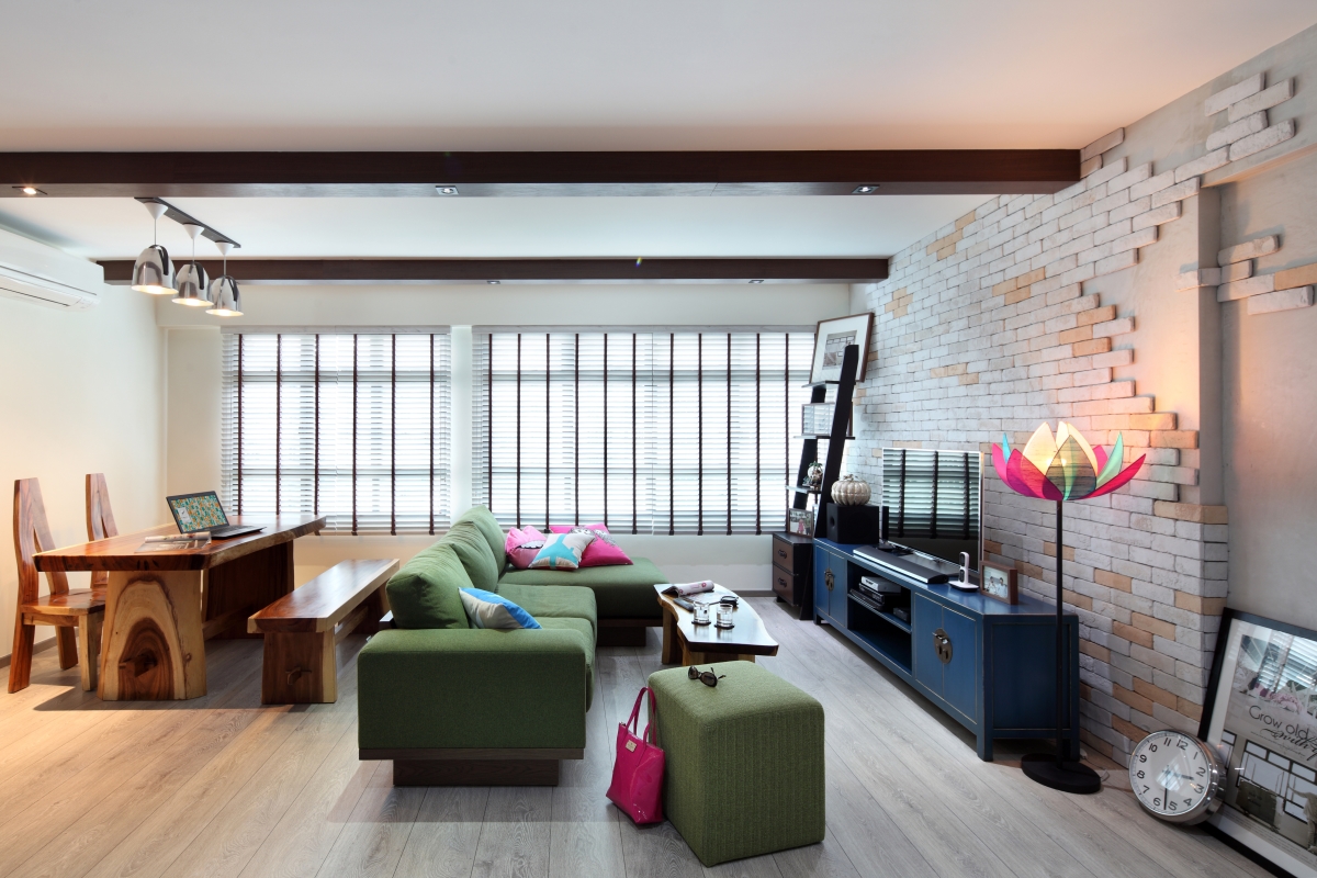


 Sign Up with Google

.jpg)