Renovation Story: An Industrial-themed Transformation
Interior Design & Decor5 minutes read
5482 views
5482 views
After shifting and moving for a record-breaking four times in six years, t-blogger Sleepybeauty decided enough was enough – time for a permanent place that she could finally call home. The t-blogger and her boyfriend wanted every inch of the apartment to reflect their personalities, which was why they jumped on the idea of a full renovation.
Before:
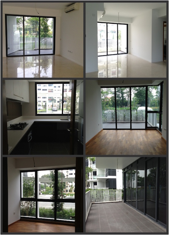
Floors and kitchen fittings provided by the developer were a big no-no for the contemporary couple's tastes. Image © SleepyBeauty
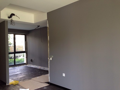
Get ready to see how the area above got transformed into a walk-in wardrobe! Image © SleepyBeauty
The previous state of the apartment was like a blank canvas that granted the pair freedom of creativity. With proper planning, they could have anything their hearts desired!
Two main features that Sleepybeauty lusted for were an open-concept kitchen, and a walk-in wardrobe. “We love having friends over, and I thought a kitchen island would be perfect for people to lounge around and have a few drinks,” quips the lady of the house.
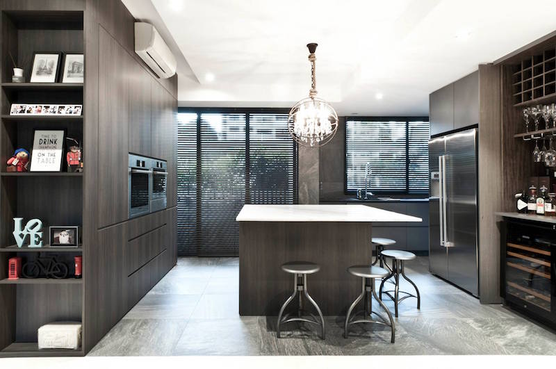
To create a large kitchen space, a wall that once separated the living and dining area was hacked. Image © ARCHITOLOGY
Industrial elegance overtakes the kitchen’s theme in the form of metal stools and brown cabinets. “The island serves as an indoor dining spot that sits up to four guests, with ample standing space for the others to mingle,” the homeowner explains.
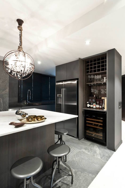
A bar counter and mini wine cellar stands stylishly next to the refrigerator. Image © ARCHITOLOGY
It was instant love when the homeowner first spotted the chandelier in a showroom. However, the light came with a chain instead of the hanging rope design that she wanted, so the crafty lady took things into her own hands!
“I really wanted the rope as it makes or breaks the whole look. Plus, it only took me ten minutes to tie it around the chain! The gorgeous end result is definitely the centerpiece of my kitchen,” she describes her DIY project proudly.
So there isn't a proper dining area? You must be wondering. That was our initial thought too, until we realised what the outdoor patio was for!
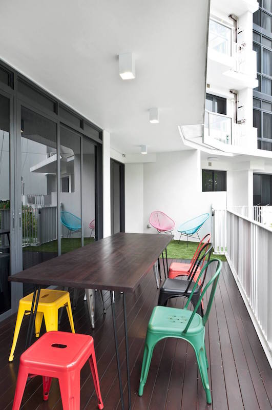
Bright-coloured chairs and stools dot the wooden deck. Image © ARCHITOLOGY
“We are lucky to have a patio that’s spacious enough to accommodate a complete set of dining table and chairs. This is mainly where we host our dinner parties!” she expresses.
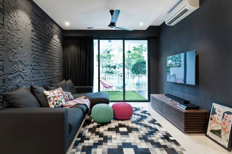
As the marble floor didn’t quite match the couple’s industrial-themed ideas, they decided to jazz it up with a quirky rug!
Image © ARCHITOLOGY
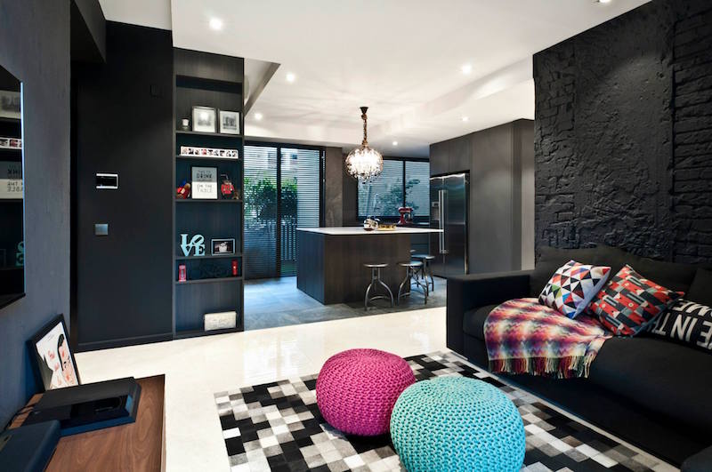
The dark colour palette allows vibrant elements such as the cushions and stools to pop. Image © ARCHITOLOGY
Notice the downlights that pepper the perimeter of the ceiling? Their abode is lit by a total of 27 single recessed downlights, which balances lighting arrangement throughout the entire space.
LED lights are known to be more expensive than halogen ones, but the latter was too hot for the couple to handle. “I remember using halogen lights in my previous apartment, and it was always so warm! The main advantage of LED is that it does not produce as much heat, so I’ll still be able to stay cool even after sitting under the light for long,” the t-blogger points out.
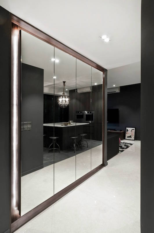
Guess what’s behind those mirrors. Image © ARCHITOLOGY
A shoe cabinet for the fashionable woman, of course! It links the foyer to the living area, and certainly beats the look of an otherwise blank and boring wall.
“I went with mirrored doors so I can easily check how my outfit matches with my shoe before I head out. Also, they enhance the illusion of space in the narrow walkway,” she mentions.
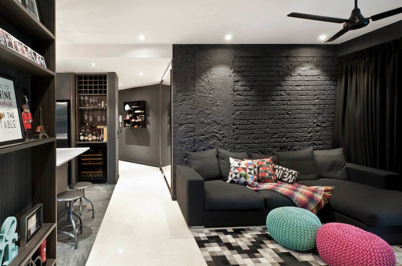
To achieve the raw, industrial effect that is so in trend these days, they opted for uneven streaks of plastering for the wall.
Image © ARCHITOLOGY
Monochromatic colours like grey and black are usually popular choices in industrial-styled homes, and this one is no different.
The young couple digs how the colour scheme exudes timelessness. “It also displays the masculine side of my personality,” the lady reveals.
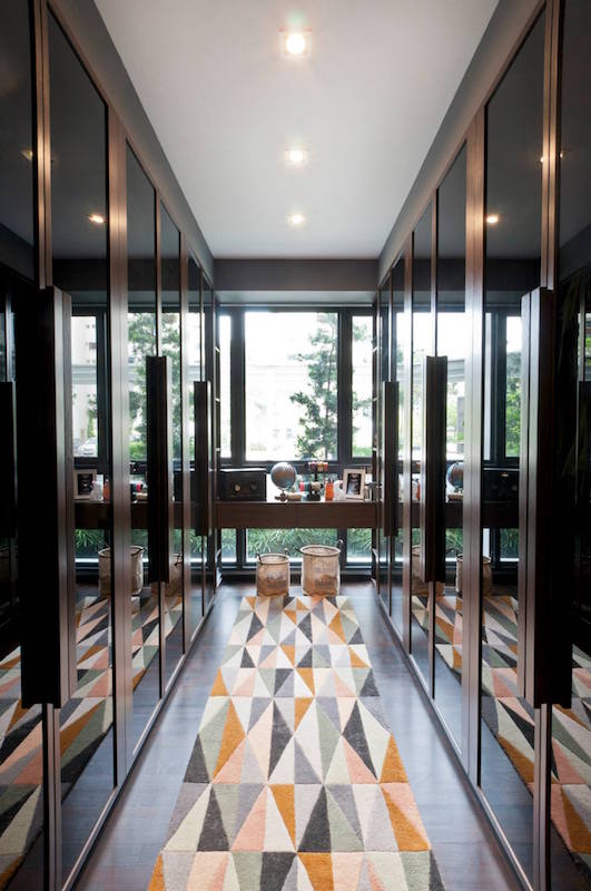
Chic, opaque closets line the side of the walk-in wardrobe. Image © ARCHITOLOGY
In order to make way for a walk-in wardrobe, a wall was hacked between the master suite and one of the bedrooms. As her favourite part of the house, the shopaholic chirps, “It’s every girl’s dream to have a walk-in wardrobe after all!”
We agree – from the looks of it, anyone who struts down that cool walkway would instantly feel like a model!
Request for quotes and we'll match you with a selection of Interior Designers!
Previous
Innovative Ways To Make Profits Out Of Your Home in Singapore


 Sign Up with Google

.jpg)

