Interior Colours to Boost Productivity and Academic Performance
Interior Design & Decor5 minutes read
2492 views
2492 views
(Guest Writer: Emma Brown)
Have you paid attention to the important roles different colours play in our life?
Scientists have constantly studied the direct relationship between a person's mood and the colour scheme of their interior, especially for their workspaces. For most people, colour matters.
Colour therapy is an ancient science; it first appeared in IV-III millennium B.C. China and India became the founders of this science. It proves that different colours give us different sensations.
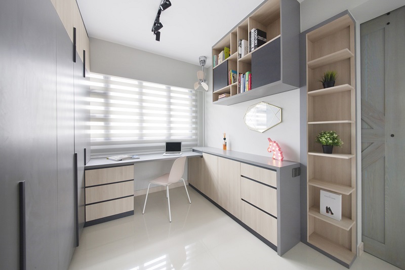
 Study room done by The Safe Haven Interiors
Recommended Colours
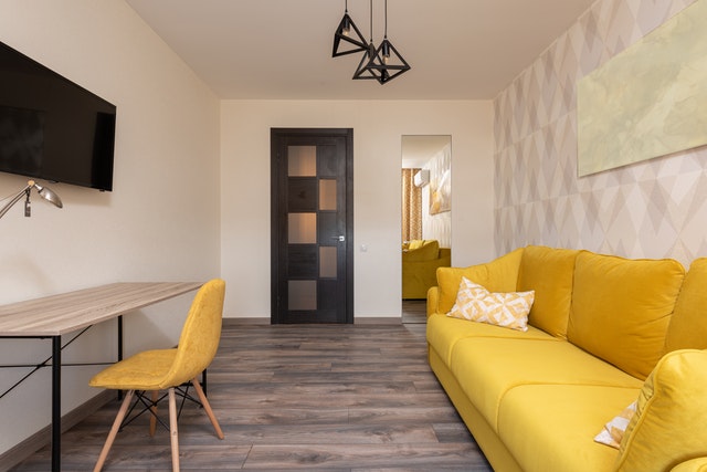
Yellow and its shades (mustard, citron, buttercream) are strong, warm and light colours, which guarantee a good mood. It looks like a sunny day; therefore, it cheers up a person and helps them experience joy and fun. Such a colour scheme is highly recommended for a space where young people think and put things into focus.
Purple and blue are from a dark and cold palette. They can evoke indecision and a gloomy mood. Light blue evokes a sense of flight and the lightness of air, helping you feel relaxed and free. But walls painted in dark blue can "freeze" you and lead to sadness and coldness.
Light green gives a healing calmness and the warmth of summer. A dark green shade, such as moss green, on the contrary, seems soft and heavy. Warm shades of green are the colours of leaves. This colour calms and relaxes people, makes people want to sleep and dream.
Shades of brown seem tough and earthy, while pure orange is soft and warm. Orange is a friendly colour.
An intense red causes aggression and anxiety and is associated with strength and activity. It creates a strong atmosphere. It can be too strong for a classroom and tiresome on a psychological level so it will be of no assistance. This is why its shades, such as coral or salmon, would be better for a learning space.
Warm, mobile colours, such as shades of yellow and red, always outweigh the calmer, cooler ones like cold blue and green. Thus in small rooms, it is better to use them in minimal quantities.
These bright active colours always sink deeper into memory, so use red or yellow to draw attention to something. Blue and green are calming colours, so they may make your mind feel too relaxed.

Photo by Max Vakhtbovych from Pexels
Colours In The Classroom
In the classroom, it will be good to combine green and yellow. If the wall holding both the teacher's board and students' attention is green with yellow surrounding walls, then the students' eyes will be less tired during class. And at the same time, the yellow tint will fill the room with light and warmth.
Studies of the influence of indoor colours on the psyche of children have shown that children of different ages prefer different colours.
In elementary school, children chose active, vibrant colours such as shades of red and pink. Moreover, the latter is mainly chosen by girls.
By the end of elementary school, colour preferences change. By the age of 9, red and pink shades are replaced by orange. Then later, children chose yellow and yellow-green colours. By the age of 11, the colour green with its corresponding shades prevail.
A year later, the updated results showed that children prefer blue and its variants. They also revealed that junior schoolchildren are not at all annoyed by the colour red. For an overly active child, the red details in the classroom interior can be soothing and organizing. Therefore, any red details in the toddler class will help avoid any disruptive behaviour and calm them down.
Colours To Avoid
Black is a very unfortunate colour in the interior, due to it dampening the mood. So it would be better to choose a dark green or dark blue surface for writing rather than a blackboard.
The wall on which the chalkboard hangs should be in harmony with the colour of the chalkboard; contrasting shades should not be chosen. Too many colours on the main wall in the classroom will tire children.
The least recommended colours in school decor will be dirty, greyish tones. They may be considered suitable in clothing, but may not be used in a learning-based interior. Choose only solid colours and shades.
When designing a classroom for teenage students, play around with blue and its hues as it is popular amongst teens. But do not forget that blue itself creates a sad and cold atmosphere, so it is best to combine it with a warm orange. Shades of orange or yellow can help children focus their attention during class.
Other Applications
Shops and music classes can use blue tones. And the gym for physical education should be painted in a combination of light blue and light green.
Halls, stairs, corridors and school gymnasiums should be spacious and warm. You can paint them in colours that differ from the classroom colours so that children can properly rest in between classes. Combinations of light blue and yellow and other contrasting options of cool and warm colours are suitable.
Bright, warm, pleasant and varied colours in the design of the school interior will improve students' moods and make learning more pleasant, influencing their academic performance in the best way possible.
And we are not just talking about academic progress for children; as a teenager or young adult, getting your desired grades may become your top priority. But as you learn under the watch of the right colours, do note that you do not have to stress yourself out over every single assignment.
For example, you can turn to professional essay writers from shinyessays.com to help complete your university assignment.
In between boosting your productivity and getting your work done, you can also take some time to consider if there are any works around your home that you can quickly execute.
Request for quotes and we'll match you with a selection of Interior Designers!
Previous
6 Things to Fix in House to Refind Inspiration For Art


 Sign Up with Google

.jpg)

