Stylish Space - Lofty Ideals
Interior Design & Decor5 minutes read
45706 views
45706 views
Interior design agency and eco warrior Sky Creation proves that adopting and integrating the three basic principles of green living into a home makeover is achievable.
Who stays here
A couple in their mid 30s
Space
Two-bedroom condominium apartment at Axis @ Siglap
Size
Approximately 900 sqf
Who says that interior designers can’t be eco-fighters too? The fact that Sky Creation is the first ever certified green design and renovation company in Singapore is proof that the fight to save Gaia still persists. Built with a vision for the future, the company employs a far from ordinary approach when it comes to going green. For them, it’s not simply about conserving energy or making use of sustainable materials. Sky Creation goes one step further by first understanding a homeowner’s lifestyle and consumption patterns, and then conceptualising environmentally-friendly design ideas based on this profiling.
“It’s traditionally assumed that eco-friendly practices cost more. Sky Creation, however, focuses on good design know-how to help you save on a long-term basis,” explains Astley Ng, the design principal from Sky Creation who overhauled the condominium apartment for these two young executives. Having recently purchased it as a resale flat, it was in a shabby condition, and unsuitable for the couple.
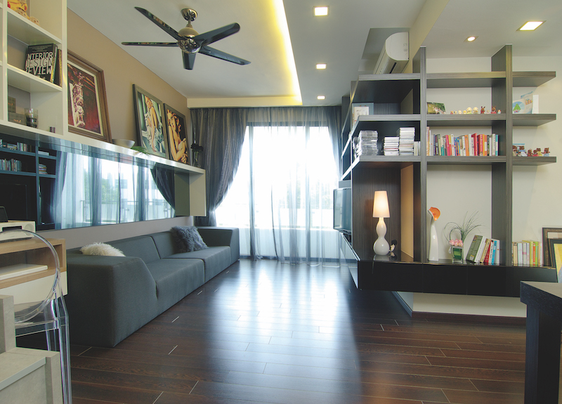
Both are bookworms, so the couple boasts an extensive collection of literature between them. The shelving units constructed by Astley also proved perfect for the man of the house’s favourite artworks, as well as his significant other’s set of adorable figurines like the world-famous Sylvanian families.
Green Philosophy
Most would expect a green home to run on electricity powered by solar panels or wind-powered turbines; but this two-bedroom residence has neither. It is, however, marked by Sky Creation’s inventive approach to conservation.
“The 3Rs - reuse, reduce and recycle - are meticulously looked into with every project that we undertake,” states Astley. “The existing lights from the old unit were old but in working condition. Minor refurbishments made these luminaries as good as new so they can continue to serve their purpose,” the interior designer continues. Instead of tossing away surplus flooring laminates, Astley recycled and transformed these into a stunning wall tableau in the master bedroom. Wastage is reduced, and the result is a personal sanctuary that embraces style.
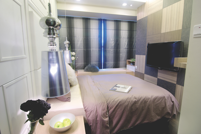
The bed faces the patchwork of recycled woodgrain laminates that serves as a sweet reminder of the green initiative that the couple played a part in.
Soaring Heights
The homeowners wanted a loft-inspired abode much like the ubiquitous studios in New York City. With roughly 900 square feet area, there really isn’t much free play. Despite this setback, Astley still managed to conjure a plan that addressed his client’s brief, yet upheld Sky Creation’s philosophy. Lofts are traditionally high ceilinged and spacious, so he decided to construct a staircase in the living room to exude the feeling of an open space. It might seem like a madcap idea, but this out-of-the-ordinary suggestion made a statement-making focal point. “I integrated extra mileage into this striking feature by fitting it with secret compartments that boast generous storage space at the base,” explains Astley.
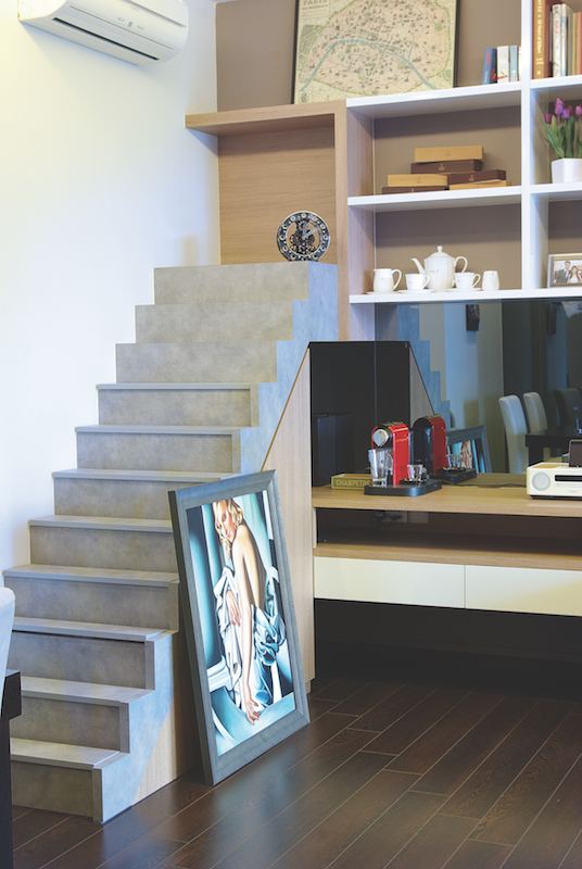
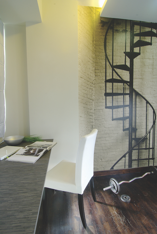
This effect continues in the couple’s study. A large full-length vinyl sticker that resembles a rooftop stairwell instantly injects style and towering presence in the previously plain room.
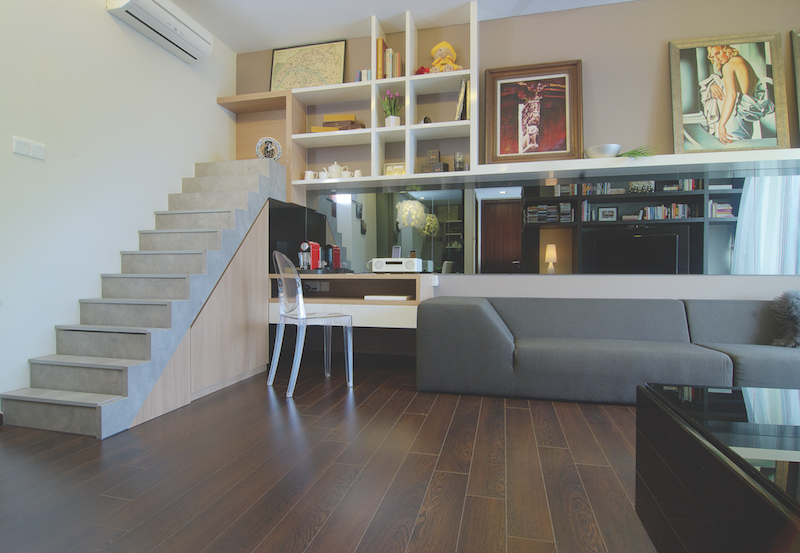
The stairway holds immediate visual impact and is exceptionally functional to boot. It makes an Instagram-worthy shot too!
The Challenge of Space
One of the issues that required attention was the sofa, as this bulky furniture was purchased way before the couple embarked on their renovation journey. Mirrors have long been famous for their prowess to optically open up a small space, so Astley fitted them in the living room where the sofa is. Rather than sticking to a standard one, the interior designer pushed creative boundaries and opted for grey tinted ones that tease with the illusion of extra space. “The level of sophistication in the living room is instantly heightened with the addition of these subtly tinted mirrors,” he says.
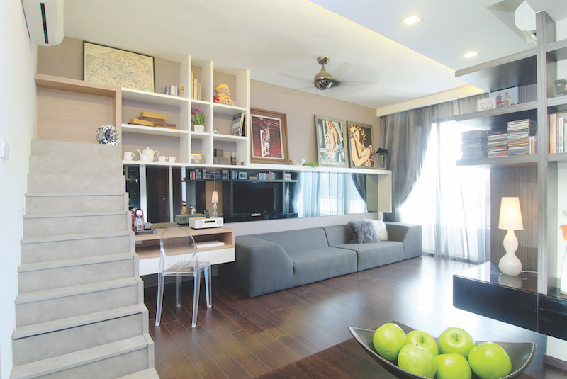
WE LOVE: The mirrored wall along the height of the sofa deceives guests into thinking the room is bigger than it really is.
Style Idea
The lack of statement lighting within the abode means the luminary over at the dining area needs to stand out. While its unique design is indeed eye-catching, Astley explained that he chose this ceiling lamp because its colour and soft form does not intrude the general style of its surrounding space. It’s an exemplary illustration of avant-garde meets understated sophistication.
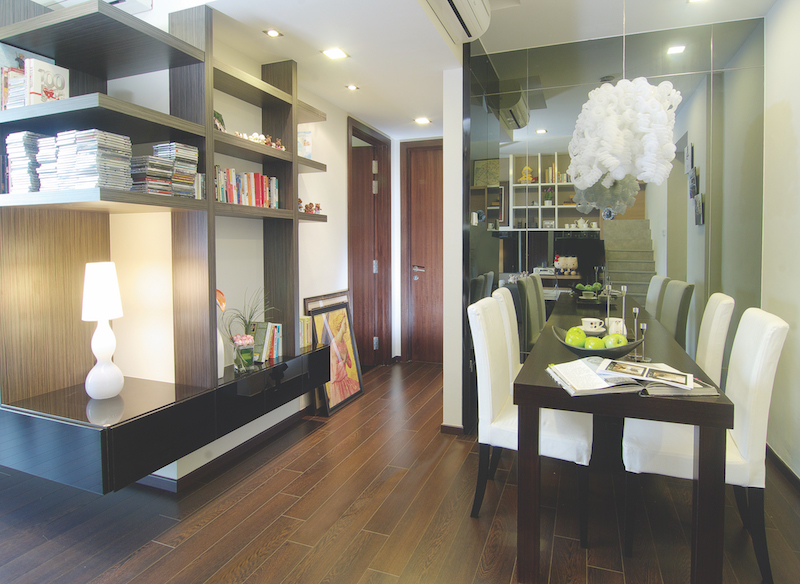
Instead of opting for paler tones, Astley went for woodgrain laminate floorings to infuse warmth into this chic apartment.
Request for quotes and we'll match you with a selection of Interior Designers!
Previous
5 Tips On Saving On Your Resale Renovation!


 Sign Up with Google

.jpg)