This Apartment Proves Homes Can Be Chic Despite Lacking A Theme
Interior Design & Decor5 minutes read
3006 views
3006 views
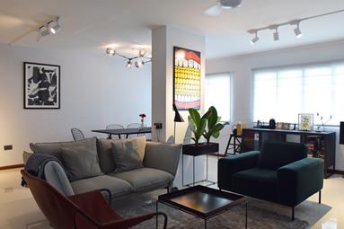
Mackie decided that it was time for her to move out of her parents’ home when she turned 35. She had 3 options then: buy a condominium, apply for a BTO flat, or get a resale flat. Mackie concluded that the most rational thing for her to do was to get the 1,300 sqft resale flat in Hougang, because a 900 sqft condominium would be $300,000 more expensive, and she didn't like the idea of having really limited space in the two-room BTO flat that she could apply for.
We went down to Mackie’s apartment to take a look at how she managed to transform an old resale flat into an extremely artsy and chic apartment for a total cost of $50,000.
RenoTalk: So how did you feel your renovation journey was?
Mackie: I felt it was quite smooth. I had the help of my dad, and he had experience in renovation. While I was busy at work, my dad came every day to monitor the renovation progress and how the work was being carried out. He also gave feedback and input so that the renovation journey could turn out well.
R: How did you decide on a concept of your home?
M: What I did was to browse through a lot of interior design blogs, websites, books, and forums like RenoTalk. From there I knew distinctively what I did not like. I was pretty amused by the trends that Singaporeans were going for, and I was sure I didn't want a home that looked like that. I then created a mood board on Pinterest and pieced together furniture that I liked, specific for each individual room so that I was able to visualize and picture how my home would look like.
R: After all that browsing and research, did you manage to choose a theme for your home?
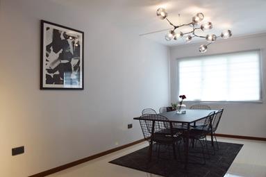
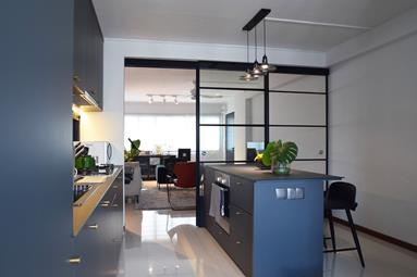
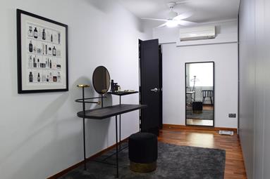
M: No, I did not exactly like the themes Singaporeans were going for. I decided on grey for my walls and picked furniture with thin black legs. As you can see, most of my chairs and tables are as such, and they accentuate the space. Unlike many Singaporeans, I don't have many build-ins, only two to be more specific, and both in the kitchen. Instead, I invested in more lightweight furniture in case I shift houses in the future.
I engaged a contractor, J&E, after going through RenoTalk, interior design magazines, and the Facebook pages of several interior design firms. I followed their progress, and while J&E was not the cheapest contractor, I decided on them partly because my colleagues used them and recommended them to me.
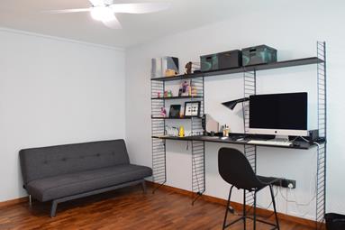
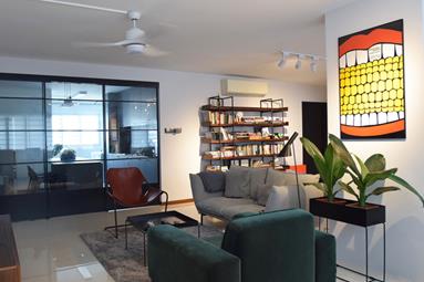
M: What I like about my study area is the customizable shelves. I bought four frames, and had the option to buy the shelves individually, and then place them according to how I like them to be. The shelves are clip-ons, and that makes them convenient to adjust according to height.
R: Do you have any advice to aspiring homeowners embarking on their renovation journey?
M: I think it is important to know what you want. Always ask questions. If your gut tells you something is not quite right, just clarify. Rethink whether you really need build-ins, because interior design firms are quite keen on them. Lastly, invest in signature pieces that you really love.
During Mackie's house tour, the RenoTalk team noticed three particular pieces of furniture in her home that we absolutely adore, and would love to share them with you.

1. The Herman Miller Sweet Corn Festival Poster
Mackie found this limited edition poster at Pomelo when she was shopping for furniture. This poster has had a rich history, and currently, only 500 pieces exist. In the 1970s, Herman Miller hired a graphic designer, Steve Frykhom, to design posters promoting its company’s annual picnic. Before long, his posters became viral, and many of his pieces are now hitting museums and galleries. This art piece depicts a sweet corn being open, and we particularly like it because of its bold, contrasting colours in a pop art style, with high gloss ink. Currently, this poster retails for more than $1,000, but is definitely a signature piece that would capture everyone’s attention.
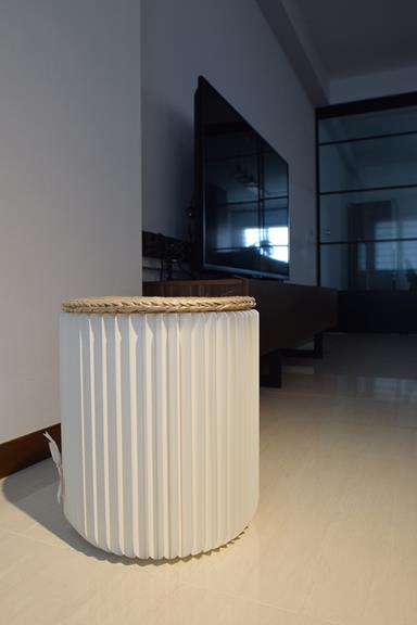
2.Paper Magnetic Stool
Mackie acquired this stool when she was in Shanghai for a business trip. The unconventional piece is entirely made of paper, attached to magnets, which hold the paper together. While it looks deceivingly flimsy, the stool is able to support one’s whole weight.
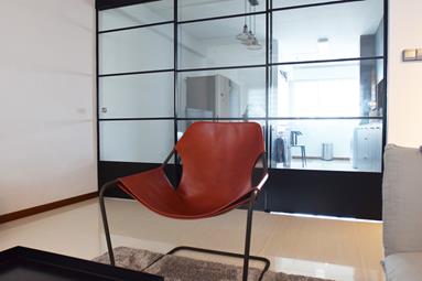
3. Wired leather chair
Mackie's chair is made out of a single wire, bent and twisted to resemble that of a chair. The chair is really stripped down to the basics, and a leather piece is inserted through the wire so that it becomes functional and people are able to plant their weights on it. As such, the leather piece is detachable, and can be replaced by any form of cloth or fabric.
We thank Mackie for sharing her home renovation journey with us, as well as her kind hospitality in allowing our RenoTalk crew to interview her and take pictures of her home.
Article contributed by Erina Tan.
Request for quotes and we'll match you with a selection of Interior Designers!
Previous
7 Cool Pop Culture Items To Bring Home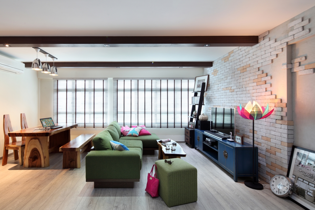


 Sign Up with Google

.jpg)